 |
| Please study the map locations and definitions for the quiz scheduled for Monday February 6, 2012 |
Blog of class materials for 8th grade geography class at Calvert School in Cochabamba, Bolivia
Monday, January 30, 2012
Friday, January 27, 2012
Learning SimCity
The purpose of today´s assignment is to learn how to play SimCity. This program introduces important concepts of urban planning and geography in a fun and interactive way.
Everyone in the group should have a chance to run the program so please take turns.
If you wish to download this program for free and run it on your own PC go to http://juegosabiertos.com/sim/simcity.php
Setup
Break into groups and open up SimCity on the computer (from the desktop icon or go to My Computer, local disc C, Maxis folder, click on SimCity icon).
From the start menu, please click on the lower box that says SELECT SCENARIO
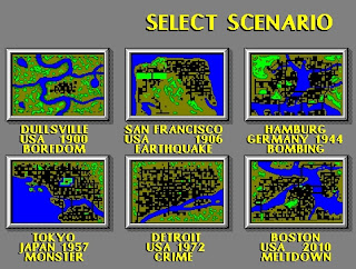 From the SELECT SCENARIO page, please click on the upper left hand box that says
DULLSVILLE, USA 1900 BOREDOM
It is your job to turn this sleepy little town into a rocking metropolis.
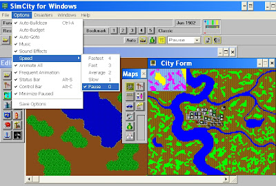
When the game opens, enter a zero ¨0¨ on the keyboard to pause the game. Notice that you can change the game speed by using the options menu or by just entering a number on the keyboard. When working on a project in the city, it is best to slow or stop the action until you are done with your project, and then speed it up to see what happens and to earn more tax revenue to be able to afford more projects.
Options Set-up - *Very Important! - This will avoid unnecessary interruptions.
Under the options menu, click to the left of the words Auto-Budget to put a check mark there (turned on), and to the left of Auto-Goto to make sure there is NOT a checkmark next to it. It should look like this below:
*You may also want to turn off the music and sound effects as they get to be monotonous.
Under the disasters menu, click to the left of the word disable at the bottom to put a check mark there (turned on) so your city doesn´t get destroyed while you are learning the program.If you want to see what happens when disasters are unleashed, please do it during the last 5 minutes of class.
Now you are ready to add building zones, roads, powerplants and powerlines, police and fire stations, and when your city can afford it, a sports stadium, sea port, and airport (wait for a message that says the population is demanding it).
In the upper left corner you have ¨Funds:$¨ which tells you how much money you have in the city treasury, and the next line below shows you what you will build when you click on the screen and what it will cost. You can change what you want to build by clicking on an icon in the edit menu (middle left below) - but be sure to check its price to make sure you can afford it and to make sure that that is what you selected.
Under the windows menu you will find various tools for learning more about your city and how you are managing it as mayor. Once you have learned the basics, you can begin to try playing with the budget to make more money, but be careful, raising taxes too high may make people move away. . .
Hint: all properties must be connected to the power grid in order for people to move in.
Today we are just learning the basics, so don´t worry about saving the game this time. Have fun!
Everyone in the group should have a chance to run the program so please take turns.
If you wish to download this program for free and run it on your own PC go to http://juegosabiertos.com/sim/simcity.php
Setup
Break into groups and open up SimCity on the computer (from the desktop icon or go to My Computer, local disc C, Maxis folder, click on SimCity icon).
From the start menu, please click on the lower box that says SELECT SCENARIO
 From the SELECT SCENARIO page, please click on the upper left hand box that says
DULLSVILLE, USA 1900 BOREDOM
It is your job to turn this sleepy little town into a rocking metropolis.

When the game opens, enter a zero ¨0¨ on the keyboard to pause the game. Notice that you can change the game speed by using the options menu or by just entering a number on the keyboard. When working on a project in the city, it is best to slow or stop the action until you are done with your project, and then speed it up to see what happens and to earn more tax revenue to be able to afford more projects.
Options Set-up - *Very Important! - This will avoid unnecessary interruptions.
Under the options menu, click to the left of the words Auto-Budget to put a check mark there (turned on), and to the left of Auto-Goto to make sure there is NOT a checkmark next to it. It should look like this below:
*You may also want to turn off the music and sound effects as they get to be monotonous.
Under the disasters menu, click to the left of the word disable at the bottom to put a check mark there (turned on) so your city doesn´t get destroyed while you are learning the program.If you want to see what happens when disasters are unleashed, please do it during the last 5 minutes of class.
Now you are ready to add building zones, roads, powerplants and powerlines, police and fire stations, and when your city can afford it, a sports stadium, sea port, and airport (wait for a message that says the population is demanding it).
In the upper left corner you have ¨Funds:$¨ which tells you how much money you have in the city treasury, and the next line below shows you what you will build when you click on the screen and what it will cost. You can change what you want to build by clicking on an icon in the edit menu (middle left below) - but be sure to check its price to make sure you can afford it and to make sure that that is what you selected.
Under the windows menu you will find various tools for learning more about your city and how you are managing it as mayor. Once you have learned the basics, you can begin to try playing with the budget to make more money, but be careful, raising taxes too high may make people move away. . .
Hint: all properties must be connected to the power grid in order for people to move in.
Today we are just learning the basics, so don´t worry about saving the game this time. Have fun!
Thursday, January 19, 2012
Exercise: Population Maps
Setup:
Open marble maps on your computer and select the atlas map with the globe projection and use this to help identify places on the maps you are analyzing. You may also want to use the "earth at night" map to locate cities and towns where people are concentrated.
 To open Marble in the computer lab, in the start menu go to "my computer", open "Local Disk C" (you may need to click on "Show the contents of this folder"), open the "Program Files" folder (you may need to click on "Show the contents of this folder"), open the Marble folder and click on the compass icon to open the program (looks like the picture on the left). You can also download the Marble QT program and install for free on your own computer at http://edu.kde.org/marble/download.phphttp://edu.kde.org/marble/download.php
Assignment:
Break into groups and on one sheet of paper, write the title "Exercise: Population Maps", today´s date, and everyone's first and last name at the top.
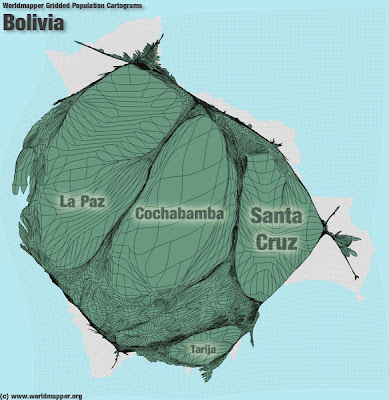
Write down the number of the map and then explain how population is shown on the maps below. What information does the map communicate and how is it represented?
2.
3.
5.
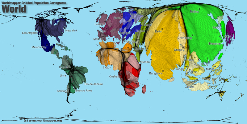
Cartogram of world population.
The size of each territory shows the relative size of the population living there. Big territories have a lot of people. Small territories have few people.
6.
7.
http://www.populationlabs.com/Bolivia_Population.asp
8.
9.
references:
http://www.zonu.com/http://www.worldmapper.org/display.php?selected=2
http://www.worldpopulationatlas.org/
http://www.populationlabs.com/
http://www.mapsharing.org/MS-maps/map-pages-worldmap/images-map/9-world-map-population.jpg
Open marble maps on your computer and select the atlas map with the globe projection and use this to help identify places on the maps you are analyzing. You may also want to use the "earth at night" map to locate cities and towns where people are concentrated.
 To open Marble in the computer lab, in the start menu go to "my computer", open "Local Disk C" (you may need to click on "Show the contents of this folder"), open the "Program Files" folder (you may need to click on "Show the contents of this folder"), open the Marble folder and click on the compass icon to open the program (looks like the picture on the left). You can also download the Marble QT program and install for free on your own computer at http://edu.kde.org/marble/download.phphttp://edu.kde.org/marble/download.php
Assignment:
Break into groups and on one sheet of paper, write the title "Exercise: Population Maps", today´s date, and everyone's first and last name at the top.
Write down the number of the map and then explain how population is shown on the maps below. What information does the map communicate and how is it represented?
1.
2.
3.
Dot density map. Each dot represents 100,000 people.
4.
4.
5.
Cartogram of world population.
The size of each territory shows the relative size of the population living there. Big territories have a lot of people. Small territories have few people.
6.

7.
http://www.populationlabs.com/Bolivia_Population.asp
8.

9.
references:
http://www.zonu.com/http://www.worldmapper.org/display.php?selected=2
http://www.worldpopulationatlas.org/
http://www.populationlabs.com/
http://www.mapsharing.org/MS-maps/map-pages-worldmap/images-map/9-world-map-population.jpg
Tuesday, January 17, 2012
Exercise: Elevation and Relief on Maps
Setup:
Open marble maps on your computer and select the satellite view with the globe projection. Find Cochabamba and zoom in to central Bolivia.
 To open Marble in the computer lab, in the start menu go to "my computer", open "Local Disk C" (you may need to click on"Show the contents of this folder"), open the "Program Files" folder (you may need to click on"Show the contents of this folder"), open the Marble folder and click on the compass icon to open the program (looks like the picture on the left). You can also download the Marble QT program and install for free on your own computer at http://edu.kde.org/marble/download.phphttp://edu.kde.org/marble/download.php
Assignment:
Break into groups and on one sheet of paper, write the title "Exercise: Elevation and Relief on Maps", today´s date, and everyone's first and last name at the top.
Write down the number of the map and then explain how elevation and relief is shown on the following maps in Marble.
Then do the same for the following maps:
4.
5.
6.
7.
Short Answer:
Explain what the lines on maps 6 & 7 represent. Read about contour lines below and then try to take the online quiz at the end.
Open marble maps on your computer and select the satellite view with the globe projection. Find Cochabamba and zoom in to central Bolivia.
 To open Marble in the computer lab, in the start menu go to "my computer", open "Local Disk C" (you may need to click on"Show the contents of this folder"), open the "Program Files" folder (you may need to click on"Show the contents of this folder"), open the Marble folder and click on the compass icon to open the program (looks like the picture on the left). You can also download the Marble QT program and install for free on your own computer at http://edu.kde.org/marble/download.phphttp://edu.kde.org/marble/download.php
Assignment:
Break into groups and on one sheet of paper, write the title "Exercise: Elevation and Relief on Maps", today´s date, and everyone's first and last name at the top.
Write down the number of the map and then explain how elevation and relief is shown on the following maps in Marble.
1. Satellite map
2. Atlas map
3. Historical Map 1689
Then do the same for the following maps:
4.
5.
6.
7.
Short Answer:
Explain what the lines on maps 6 & 7 represent. Read about contour lines below and then try to take the online quiz at the end.
What are Contours?
Contour lines are a kind of isoline drawn on a map which connect points of equal elevation and are used to illustrate three-dimensional features or relief on a flat map.
Contour lines are a kind of isoline drawn on a map which connect points of equal elevation and are used to illustrate three-dimensional features or relief on a flat map.
This means that if you physically walked along a contour line, your elevation would remain constant and you would go neither up nor downhill.
Contour lines show the height of ground above Mean Sea Level (M.S.L.) in either feet or metres. For example, numerous contour lines that are close together indicate hilly or mountainous terrain; when far apart, they represent a gentler slope.
If you have time, try this Contour Line Quiz
references:
Topographic Map Contour Lines
Friday, January 13, 2012
Map Projections Exercise
Setup:
Open marble maps on your computer and select the satellite view with the globe projection.
 To open Marble in the computer lab, in the start menu go to "my computer", open "Local Disk C" (you may need to click on"Show the contents of this folder"), open the "Program Files" folder (you may need to click on"Show the contents of this folder"), open the Marble folder and click on the compass icon to open the program (looks like the picture on the left). You can also download the Marble QT program and install for free on your own computer at http://edu.kde.org/marble/download.phphttp://edu.kde.org/marble/download.php
Open marble maps on your computer and select the satellite view with the globe projection.
 To open Marble in the computer lab, in the start menu go to "my computer", open "Local Disk C" (you may need to click on"Show the contents of this folder"), open the "Program Files" folder (you may need to click on"Show the contents of this folder"), open the Marble folder and click on the compass icon to open the program (looks like the picture on the left). You can also download the Marble QT program and install for free on your own computer at http://edu.kde.org/marble/download.phphttp://edu.kde.org/marble/download.php
Introduction:
Globes are the most accurate way to represent the surface of the Earth. However, you can´t see the whole world on a globe at once, and globes are hard to carry around. To make a flat map makers must figure out how to represent a round map on a flat piece of paper through a map projection.
A map projection is a way of showing the surface of a three-dimensional sphere on a plane. Such projections are necessary to create flat maps.
To understand the projections, it is easier to imagine a light source, a globe, and another geometric object. The light source shines "a shadow" of each point of the globe onto the geometric object. At the end the surface of the geometric object is unrolled, this yields the map.
The problem with projections is that they change the surface in some way; this is called distorsion. Depending on the purpose of the map, some distorsions may be acceptable. For this reason, there are different map projections that serve different purposes.
Distortion
There are 4 types of distortion possible on a flat map.
There are 4 types of distortion possible on a flat map.
- Size (area or square miles)
- Shape
- Distance
- Direction
You are going to look at the distortions in the maps below and compare them with the globe in Marble Map.
Assignment:
Assignment:
Break into groups and on one sheet of paper, put the title of the exercise "Map Projections Exercise", today´s date, and everyones first and last name at the top.
Then below that on the front side of the paper write down:
1) Size and Shape Distortion
2) Distance and Direction Distortion
Then below that on the front side of the paper write down:
1) Size and Shape Distortion
2) Distance and Direction Distortion
Write out comments and notes about what you found while analyzing these distortions in the maps below.
1) Size and Shape Distortion
Compare the sizes and shapes of objects in following maps and with the "globe view" of the world in Marble Maps:
Mercator Projection - was designed for ocean navigation but distorts the size of objects. This distortion increases from the Equator to the poles, where it becomes infinite.
Peters Projection - is an equal-area map where areas of equal size on the globe are also equally sized on the map. But it distorts the size of objects.
Robinson Projection - was specifically created in an attempt to find a good compromise to the problem of readily showing the whole globe as a flat image.
For example> Compare the size of Greenland to Australia on these maps and the globe view of marble maps.
The Mercator projection portrays Greenland as larger than Australia; in actuality, Australia is more than three and a half times larger than Greenland.
2) Distance and Direction Distortion
On the flat Mercator projection map, try to guess which is closest and which is furthest (distance) from Cochabamba to the following places: Sea of Japan, Australia, North Sea, Arabian Sea. Also try to guess what direction you would take to go in the straightest path to get there.
Then, compare this with what you get using the measure feature* in marble maps, try looking at the distance and direction/path between different points on the globe.
*measure feature (Marble allows you to measure distances between two or more points on earth. To do so click the respective points in correct order on the globe using the right mouse button. On each click a popup menu will appear which allows you to add a measure point (Add Measure Point) or to remove all measure points altogether (Remove Measure Points). Also try switching between globe projection and flat map projection view in Marble to see where the path goes.
Mercator Projection
Compare the Mercator Projection above and the Gnominic Projection map below. Try to guess what direction you would take to go in the straightest path to get between the following places:
Sea of Japan to the North Sea
Bering Sea to the Black Sea
Los Angeles, California to Cairo, Egypt
Madrid, Spain to Tokyo, Japan
Then, compare this with what you get using the measure feature in marble maps. This will plot a red line that is the straightest path. Then change Marble´s map view to see the path mapped out on a flat map.
Gnomonic Projection - displays all straight lines on a globe (great circles) as straight lines. Thus the shortest route between two locations in reality corresponds to that on the map. Note that because of the extreme size distortion, it cannot show the entire globe at once.
Compare the maps below with the globe view of the world in Marble Maps.
On the flat maps below, try to guess the (distance) from Denver, Colorado to the following places: Sea of Japan, North Sea, Australia, Arabian Sea, Indian Ocean, Antarctica, North Pole. Which is closest and which is furthest away? Also try to guess what direction you would take to go in the straightest path to get there.
Then, compare this with what you get using the measure feature* in marble maps, try looking at the distance and direction/path between different points on the globe. Then change Marble´s map view to see the path mapped out on a flat map.
Azimuthal equidistant projection - Distances and directions to all places are true only from the center point of projection. Distortion of areas and shapes increases dramatically, the further away one gets from center point.
References:
- A detailed discussion of map projections can be found on the USGS Map Projections page.
- A site that allows you to view the world with different map projections.
- A gallery of map projections.
- Map Projection overview, Peter H. Dana.
- Mercator Projection
- Peters Projection
- Robinson projection
- Gnomonic projection
- Azimuthal equidistant projection
- the World according to GARP - azimuthal equidistant map generator
Map Quiz 1
8th Grade Geography - Map Quiz 1 - Thursday January 19, 2012
Using the map on pp. 18-19 of your textbook, please study and memorize the location of the following physical features on the world map: North America, South America, Europe, Africa, Asia, Australia, Antarctica, Pacific Ocean, Atlantic Ocean, Indian Ocean, Arctic Ocean, Mediterranean Sea, Red Sea, Black Sea, North Sea, Caribbean Sea, Gulf of Mexico, Arabian Sea, Sea of Japan, Bering Sea
Please review the definitions of the following terms as they relate to maps:
map key (map legend)
map scale
map projection
compass rose
latitude
longitude
north and south poles
relief
elevation
isoline
Subscribe to:
Comments (Atom)


